Second Outcome Proposal
I have decided to move away from my previous idea for my first final outcome, and I am now directed towards a more surrealist and conceptual approach inspired by the likes of John Baldessari and Simon Gill; both conceptual photographers. My initial idea is to take photos of typical western society, eg: crowds, people, faces, bustling areas in London and edit them into black & white and print them. The whole idea behind the black & white filter, is that learning from the first original outcome and previous experience in portrait photography, black & white can be more effective when it comes to documenting a photo with an obscured subject and one that is very 'busy' content wise. On top of this, using techniques from both Simon Gill and John Baldessari, similarly they both obscured and obstructed in someway the main focus of the picture. For example John Baldessari's work where he obscured peoples faces with multicoloured dots from the mid 1980's onward, and Simon Gill's ideology of the subject embedded or aided to help make the images, for example his use of Red Bull mixed with photographic developer to change and re-craft his images. In much the same way, my idea is to then, once printed disrupt the photo by splashing/pouring or blowing coloured ink over the images. This is based largely off of John Baldessari's dots work and this also explains why my images will be in black & white so as not to overcrowd the photo with colour and enhance the disruption, not the photo. Within my work, the ink is a representation of newspapers and the media and how the ink they use to publish stories and articles brainwashes and taints society to become paranoid about characteristics and appearance and unaware of the true newsworthy stories. The idea of the ink disrupting the work and the context of the photo, is almost similar in a way to the meaning behind Ai WeiWei's Sunflower Seeds work. With Ai WeiWei's work, the meaning is so blatant yet often not seen, as the seeds ended up in a western country being walked over by western people, showing how despite all the efforts made by the eastern countries, westernization tramples and literally walks all over the tradition of suburban Beijing life.
Inspiration
-John Baldessari
|
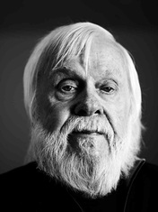
John Baldessari born 1931, is an American conceptual artist and photographer and is most well known for burning his entire art works in 1970 as well as placing coloured dots over faces from the mid 1980's onwards. He taught art in schools and colleges for over 3 decades and stopped in 2008. His work to me is very influential and the simplicity of his ideas is key to such unique artwork.
"Talent is cheap" -John Baldessari |


-Stephen Gill
|
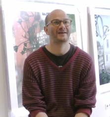
Stephen Gill, born 1971, is a British conceptual photographer who most often experiments with materials and incorporates them into his work. An example being when he used a Red Bull drink to disrupt and distort the photo. Stephen Gill said the idea behind this was to let the subject lead the photographer, and there is a sense of curiosity and excitement to see how the end product turns out.
"I listen to the subject, and almost allow it to carry me." -Stephen Gill |


Starting Points
As a starting point for my final idea, I will take the idea to photograph many people and faces and each photo will be of a person or group or crowd of people, this is to help with experimenting for the final idea. I want to capture the individual and also the sense of a group of people in a compact notion, yet although not necessarily knowing each other, they have a sense of united naivety against the media and 'social norms' which have been forced against us in a western society in London. This will be shown by the final process, which includes the splashing of ink to show the disruption, much in the same way and influenced by both John Baldessari's coloured dots and Stephen Gill's unusual use of materials to incorporate and disrupt the photo subject. The idea that some photos will be portraits, will reflect those in society knowing of the disruption that the media has over us, yet has no power to detract this. The images of groups or crowds of people are the ones that ultimately reflect society as a whole and those who read and listen to celebrity-orientated stories with such detail, intent and in an intrusive manner. The theme of contrast works its way into this project in the way that the black & white images and the contrasting bright ink emphasize the meaning behind the project and adds a sense of contrast in the sense that the public believes it has control over the media, yet in reality social media and the likes has a much more dramatic and powerful hold over us. Also, the contrasting viewpoints of those in leading media power and the citizens of a western nation can be seen within the photo.
Set 1
|
These particular photos were taken on a Ricoh GR camera over a 10 second time lapse to get the effect of the lights exploding on the face- much in the same way the ink in my original idea covers and disrupts the photo. One was a self-portrait and was taken of myself, while the other I took asking the subject to pose in a shocked and raged state to emphasize the meaning of society to him.
|
|


|
|
I also took a few portraits which I will incorporate into the final piece. I have edited them into black and white following my original idea. They are the product before the ink. I think from judging the photos, I want a mix of both the subject looking into the lens and also unaware of the photo being taken. This makes the series of images more interesting and suggests how some people are aware of the media and how others are blissfully unaware. |


Set 2
|
I then took more photos to build up the amount I have. I decided to start editing the photos and experiment with blurring or obscuring the faces. As you can see, I have experimented with blending and using double exposure to create a blurred effect on the face within the photo. This was done on the app "Pixlr" which allowed me to obscure the face and add as many photos to the original over the top as I needed to.
|
|


Using these photos as inspiration I then decided to experiment further with double exposure. Therefore I used my earlier photos and decided to blur and mix the two to create a disordered and disorientated effect. The first is a simple double exposure of the two images, the second is with an added filter to further add the idea of mayhem and chaos. I personally prefer the second one with the added filter as it enhances the haywire effect and how incapable we are as a nation to change the effect the media has on us.


Outcome Ideas
Looking back through my work, I have decided to alter what I think my final piece will look like. Instead of working with lots of images and covering each face individually, I think a better and more effective and appropriate idea would be to use a smaller amount of photos and use double exposure and time lapse (like the above photos) to create a more effective and chaotic photo to portray the chaos and confusion the media has on the public of London. I think I will do a series of mounted photos which I will have printed out showing the different reactions and opinions of the British media.
Set 3- Working on Double Exposure
|
Following on from my new idea for the final outcome, I decided to experiment with using double exposure and how I could possibly convey meaning through the focus and colour of the photo. Here, I added in a photo to the original which connects the the person as it is the society from where they are from. I used focus to alter the meaning, the more blurry version displays the idea that the subject is not very aware of the media and lets it pass over him, whereas the more in-focus and stronger coloured images represent how he has taken control and realised that he does not have to pay attention to what is plastered around the UK.
|
|


Looking at this set of images, I have decided to not abandon the idea of double exposure entirely, but go back and focus more on covering faces with ink. For this to work I need to have rough prints of some of the portraits I have taken, for me to then apply the next stage. As prep work for my final piece, I decided to experiment with the ink splashed over the photos to see how it would look and hand the responsibility over to chance, with the guidance of how I blow the ink through the straw. I took the images I have taken previously and using bold drawing ink used a straw to create these patterns disrupting the initial photo. In each photo I purposely aimed to cover the face as using inspiration from John Baldessari's work of the coloured dots. I also wanted to see if a white border looked better than a full A4 sized picture, therefore I experimented with both sizes and I feel that the white border does look more effective, however instead of simply having a plain white background, I may experiment with using relevant newspaper clippings to further indulge on the idea of the media having all control over the way we think and perceive the world.


As an evaluation of the product, I have decided that the white border looks most effective as it gives room for the ink to show, however I feel that for the final piece I will mount the printed out photos onto blank white mounting paper and get the full effect of the ink that way. I created a tester of the ink on photographic paper to make sure the ink would dry a well as it did on the usual printing paper. The conclusion is that it works even better and I will print my photos out in photographic paper for the final piece.


|
These are the final images that I will use for my final piece, they are photos that I have taken myself and already experimented with in my prep work. I have printed them onto photographic paper and will apply the ink and the next stage in exactly the same way as I have previously experimented.
|
|


These are the images of my final piece. I feel that overall the end result was what I had hoped and the different amounts of ink are able to reflect how certain people feel affected by the newspapers and magazines in our western society. I tried to ultimately obscure and cover the subjects eyes with ink and blow the ink from there, as the eyes are a central and personal aspect of each individual. The eyes are what perceives the news and allows us to read it in the first place, hence being the first effected area to in a way witness the pressure we endure as a society.


Evaluation
I feel that my final piece turned out well and as I expected. My original idea is still present within the product, even though I had the opportunity to change and alter elements throughout. The overall appearance is neat, and the idea to mount the pictures gave the work a more presentable and sophisticated look. The concept and the idea behind my work, I feel worked really well and allowed me to explore a wide range of processes and techniques if I wanted to. Although I decided on how to present my work from an early stage, I passed through ideas such as the use of double exposure, which although I experimented with, I did not end up doing but it led me to further ideas which aided in the final piece. On top of this I feel that, the choice to use black and white portraits worked well with the coloured ink, however I think that it would have been even better if the concept behind the images was more evident. I maybe could have done this by incorporating newspapers or magazines into the piece somehow maybe in the form of a collage or used within the background. Having said this, I feel that overcrowding the images would have taken away their impact and detracted from their quality and meaning, which was a problem within my last final piece which I think I have overcome in this one.
In comparison to my last final piece, I think that I have taken on board the idea to make sure that the impact of the images were not lost. Therefore I gave each image its own mounted board so that the viewers focus would be on that image alone, without the distraction of the others. Overall, the end product is much more preferable to me than the last one, as working with a concept in mind really helped me move through what I wanted to achieve. This whole idea was down to the influence of John Baldessari and Stephen Gill, both conceptual artists whom had a reason behind their work. Stephen Gill often experimented with the disruption of liquid and let the idea of chance play a role within his work. I too decided to use ink and splash it in a way which I did not have much control over- this linking back to the idea that the media has all the control over us and what we think and the ink playing that roll over the portraits. John Baldessari's coloured dots series mostly inspired me during this project, as the idea of concealing and disrupting the image underneath made me think of the reason why and that is what I want to achieve when people view my work.
In conclusion, I feel that the idea behind my work and the final piece has worked well, and in comparison to the last one shows more sense of maturity. If I were to pursue this idea further, I would try to experiment with ways to get my viewpoint of the media across more clearly with reference as to why I might feel like this. Yet despite this, I feel this final piece relates to contrast in the way that conceptually people have contrasting ideas about the media and not everyone necessarily feels the same. As a more obvious and artistic point, the ink being a bright colour heavily contrasts with the black and white of the portraits which helps to make the idea stand out and emphasise how controlling the media is. This piece is a successful close to the theme of 'Contrast' and reflects a photographic as well as a conceptual approach.
