First Mini Project- Contrasting Architecture
Project Proposal
For my project proposal, I am interested in looking at the contrast in architecture and from old buildings to new. I want to base my project on the work of Lewis Baltz and Luigi Ghirri. Although their work contrasts, I feel that I can take elements of each or do the same building in different variations relating to the artists. I want to start by taking a building- such as a church, and photographing it in various ways and perspectives. I will take a more erratic approach and not plan too much how the method will go, however for the final piece I want to create a long strip of photos travelling through contrasting buildings- possibly from old to more modern. My preferred take would be that the buildings are in black & white, however I can not be sure until I have experimented with colour as well. My idea links to the theme of contrast in the way that the buildings contrast in age and also the lines and edges are stylistically different.
Revisiting this idea, I have now decided that instead of creating a long strip of images, which is not as creative as I first imagined, therefore I now think creating a collage of all the combined structures will be more effective. It will show the contrast in a more effective way and I may make it 3D to emphasise the meaning and different perspectives behind the piece.
To review my method and more on the project click here.
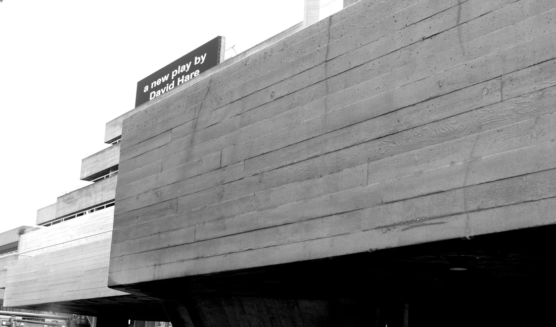
Inspired by the work of Lewis Baltz and Luigi Ghirri, I have composed images of structures and buildings within the environment looking carefully at how each artist portrayed the buildings. Lewis Baltz took a more geometric approach to architecture with straight lines and definite edges, whereas Ghirri took a more subtle approach, using less emphasis on lines and shape and focuses more on the context of the photo. Within my first set of photos I looked at contrasting the age of the buildings, starting from structures based from the 7th century such as churches up until modern day architecture such as the National Theatre and Canary Wharf. I have also used photos taken from my experience at the Barbican. The pictures are already edited into black & white and I have added a higher contrast to help define the shapes and lines within the photos.
Set 1. |
|


For my second set of images I decided to experiment with the structures and geometric lines. This is so when I come to taking the photos for my final piece of buildings, I have experience with making sure the lines of the buildings are straight. I also wanted to experiment with having more in the frame of the photo instead of just one building, however from the results I think that I much prefer Lewis Baltz style approach and have one subject within the picture. These are the raw images.
Set 2. |
|


Edited PhotosI took a selection of the images I thought turned out best, and then edited them into black and white (following my original idea) and increased the contrast to make the light tones and dark tones more definite. I also straightened the photos up, as I think with such geometric pictures the lines need to be as precise as possible.
|
|


Set 3.This is the set that I will predominantly use for my final piece, using sections of each photo to make up a collage of different structures and lines. When taking these images I was solely focused on the preciseness of the light, line and space which are some elements taken from the formal elements. I was interested in the contrast of the background being a bleak white, compared to that of the building, and how effective the negative space can be when photographing. I found that the space behind the subject of the photo helps to exaggerate and highlight the dark tones and geometric lines of the buildings, emphasizing its rigidness.
|
|


Inspiration
After taking a few sets of photos, I now need to think of how I want each photo to be perceived and how I will display the photos for the final piece. My idea for the final display, is based off some inspiration of collaging the structures of buildings. I want to take all the photos in black and white and then collage each contrasting structure by merging them together. This helps to alter the perspective of a normal standard photo of a building and would make the viewer question which parts belong to which original building. I am interested in the lines and angles from which the photos are taken, and want to convey this even when used in a collage.


After looking at my inspiration photos, I am going to try and replicate the photo which has enhanced the lines of the building and filled the structure in with blue. I decided to contrast from the original black and white image and use vibrant colours to exaggerate the lines of the buildings. Instead of like the photos from Pinterest where the artist filled the building in with block colour, I used the multiply option on the layers on photoshop to keep the detail of the building so as not to lose the impact of the photo.


After editing the photos, I then wanted to go onto the next part of my proposal which was to create the final collage of different structures. Using ideas from the stitching above in my inspiration section, I have decided that I will try to create a 3D collage in the shape or structure of a bridge itself based off Waterloo Bridge; I will create lines using thread to form the poles holding up the bridge and the design will be generated out of black card for simplicity as the collage will be busy and compact. Using the photoshop images to add some colour and dimension to the collage, I will then build around those working up a full A3 side of the collection of photos I have taken.


Evaluation
I feel that my final piece was how I intended for it to turn out, as the collage has filled up the desired amount and the placing of each building structure was thought out and overall looks relatively neat. However, I feel that the impact of the photos I had taken is lost within the collage as the individual images worked well but when combined have lost their rigid lines I spent time trying to achieve. I feel that a better way to present my photos could have been to develop them first and instead of creating a 3D structure, I could have worked 2D. This will be taken into account on my next project proposal as I feel all the attention I wanted to draw to my photos is lost within the structure instead. Also, unfortunately the card could have resembled the structure of a bridge more, my creativity could have been stretched however saying this, I feel that the thread did work well and adds an interesting touch which will make the viewer question its purpose.
When creating my final piece, I cut each photo out individually and cut around the structure which gave a better effect compared to if I cut it in a square shape. I think although this worked best at the time, the overall impact was lost as I previously stated within the structure. I then organised each building with other contrasting structures and used the photoshop images sparingly to give a burst of colour. Once the collage was done, I then worked my way through threading which although was done to give the effect of a bridge, however it also held up the folded card and gave a better overall look to the piece. Unfortunately the structure is not strong enough so one side is liable to collapse, which again is another point for which I can take into consideration and make better for next time. Having said this, I feel that this project has come to a close and I do not think that I will pursue this work anymore. I feel that starting a new project will benefit me much more, as I can use skills from this piece and transfer over to another project.
Overall I feel that the original idea is creditable and unique and definitely based off Lewis Baltz's work, also the quality of the photos taken was over average and I think would have worked very well given a better display method. It would have been even better if I had thought through a better structure other than the black card, but the simplicity definitely works in my favour due to the compact collage creating a busy visual look. Points I will remember for next time, will be making sure the photos do not get lost in each other and are displayed making sure to show their full visual potential; furthermore I will work with less materials in order to not loose the impact of the photos.
